
Product
Yelp Guest Manager
Role
Product Designer
Timeline
4 months (Shipped 2019)

Overview
Yelp Waitlist is a table management tool that allows restaurants to seamlessly manage their waitlist & front of house operations. Yelp Waitlist spearheaded the way for diners to join the waitlist remotely from the Yelp app and notify them when their table is ready saving hours of wait time.
Challenge
Front-of-house staff undergo an incessant and stressful experience during peak restaurant hours because they have pressure from managers to quickly turn tables and keep guests happy. Managing 50+ parties on the waitlist is overwhelming and the current experience makes it difficult for them to properly plan and seat guests.


Hosts are constantly bombarded with 10 (quite literally!) different tasks simultaneously and it is especially overwhelming when during a huge rush.
Approach
What we want to achieve
Our primary goal was to grow our middle-large scale casual restaurants, thus growing our Yelp Waitlist user base. Additionally, we knew we had to introduce a unique product offering to strengthen our value prop and become the leading choice for restaurant front-house-house management systems.
I interviewed customers from the west coast to the east coast in order to understand the end-to-end process of how hosts are currently making waitlist decisions and identify any problems or barriers hosts encounter when managing the waitlist using our app. I also conducted ethnographic research, working shifts with 7 different restaurants in order to learn the unique processes of each host.
One "size" does not fit all
All of our front-of-house managers collectively agree that efficiency can be improved when managing their guests. Every restaurant (and host) has created their own solution to keep track of seating and waitlist management, which can often lead to inconsistency, miscommunication, and confusion.
Pre-planning seating in order to maximize seating is a common trend among high foot traffic restaurants, and they tend to run tighter ships with stricter guest rules. While there's no perfect science yet, there's room for improvement. Giving managers confidence in their hosts managing the waitlist with minimal supervision is a top priority for our customers.
Status Quo
About 1/3 of the screen real estate is for managing the waitlist, showing about 9-11 parties at a time. During peak hours, the waitlist could reach 100+ guests.
Explorations
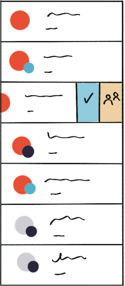
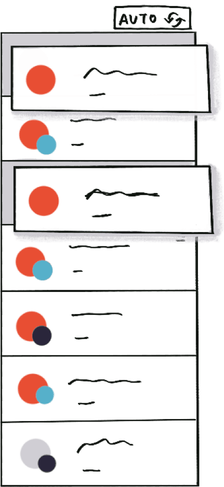

Early wireframes included options for new status icons, quick swipe actions, and rearranging parties — manually and automatically.
After a few iterations and some quick testing with hosts, we learned that hosts are not using the floor plan during peak hours. What if we added another layout view?
We put two new layout views in front of some of our customers and found that it was easier to plan more efficient seating by separating their guests by status. This direction resonated most with almost all of our customers and they found it was easier to view more in the same frame and felt they would be able to queue up guests and save hosts from taking extra steps.
Constraints
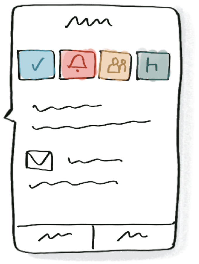
Our current “party” popover is limited to 3 contextual statuses at a time. Party options varied depending on the current status they’re in. Due to the time and budget constraints, our solution is limited to working around these contextual statuses.

I leaned onto the data and looked into the action frequency of our party options, and how they were being triggered with different statuses. With further digging, we learned the “Assign” status option was seldomly used and almost exclusively used right before a party was seated... you guess it--for staging purposes.
Based on this, it was clear a “staging” status would be a pivotal option at all stages of a waitlist or reservation party.

Outcome
We tested our new designs with a 7 restaurants in the San Francisco area and found there was a higher learning curve for restaurants who aren’t practicing “staging.” Additionally, “staging” didn’t resonate with some of our restaurants, even for higher volume ones. We updated the copy “All Arrived” and it rang clear to everyone across the board.

We released this feature to 150 restaurants that volunteered to opt in and we tracked usage in the first two weeks. On paper, it flopped.

But numbers don’t always tell the whole story...
About 45 of those restaurants used funnel view on a consistent basis. Of the 45, 30 showed high usage--as we hypothesized, were heavy volume hitters. Bingo.
Following the launch, we immediately signed on multiple locations from several national chain restaurants. This layout funnel view eventually outperformed the others leading us simplify the experience to two core views for customers.